
Challenge
The company competes in a crowded logistics market where nearly every competitor's site looks the same generic "logistics blue." It needed a premium, distinctive brand presence for clients across several European countries.
Solution
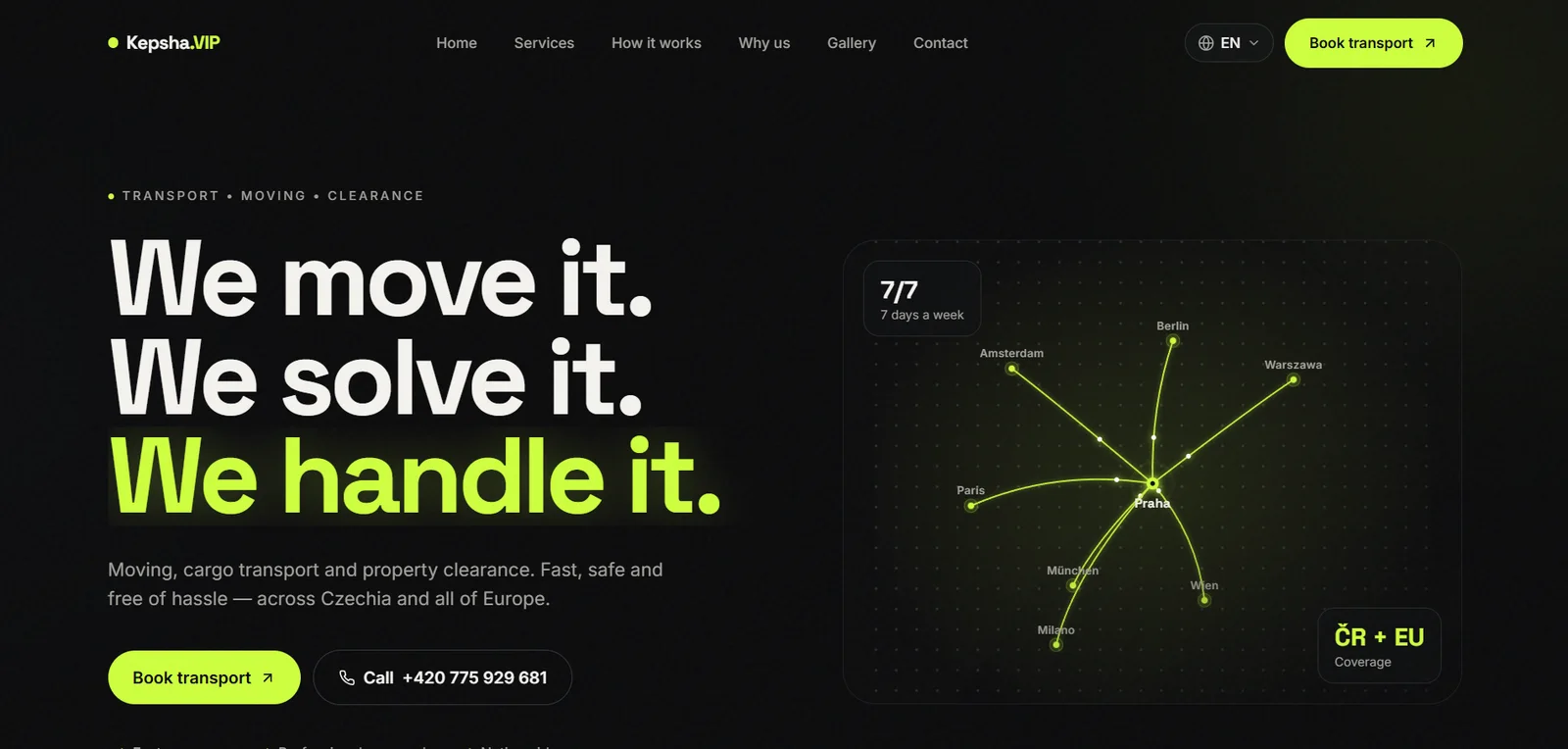
We designed a dark, near-black site with a signal-lime accent and a movement/route-line visual metaphor throughout. We built 4 full language versions (cs/en/uk/ru) with a persisted language preference, plus a quote request form.
Result
A premium brand presentation that stands out from typical logistics sites, with a clear path from first visit to inquiry across four language segments.
What we did
4 full language versions: cs/en/uk/ru
Premium identity instead of the typical "logistics blue"
A route/movement visual metaphor carried through the whole site
A quote request form for shipment pricing
Want the same results?
Tell us about your business — we'll show you the approach that fits.
Discuss your project